Note: all content is shared with the permission of Ooma Inc.
Ooma Smart Cam, previously called Butterfleye, is a smart security camera with powerful facial recognition capabilities. After Ooma acquired Butterfleye, I took the initiative to perform usability testing to ensure the camera would meet the company’s standards for user experience.
I started by getting a spare camera and performed a heuristic usability evaluation of the setup experience, noting pain points and areas that needed further study. This report was submitted to key product managers to keep them aware of my research processes. Using this information and review of best research practices for this type of product, I then created a thorough methodology for an in-house usability study with volunteer Ooma employees. This methodology was shared among the product team and given approval from team leadership. Below was the diagram for the usability lab I would set up, a first for the company. Although this may appear unorthodox for a lab plan, this was drawn in a style to make it easier for stakeholders to understand how the lab would work.

The following aspects of the user experience were tested:
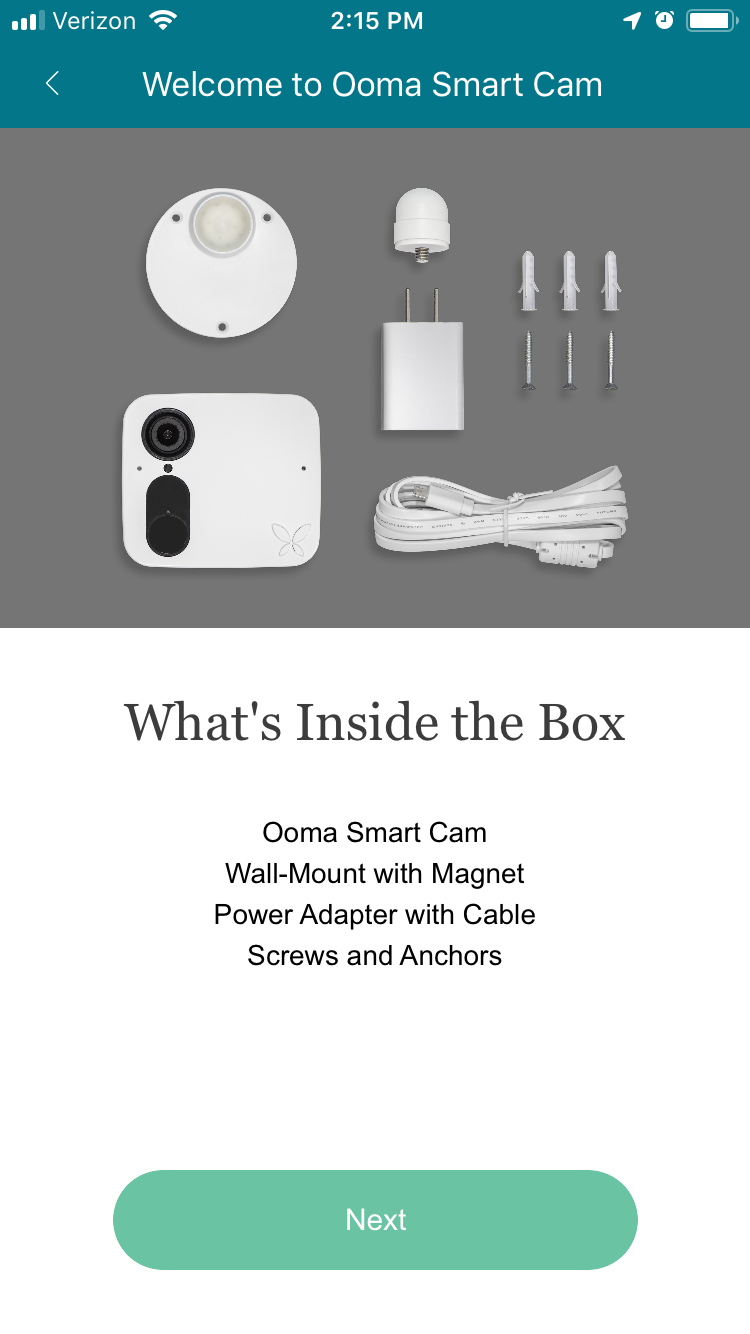
Unboxing experience
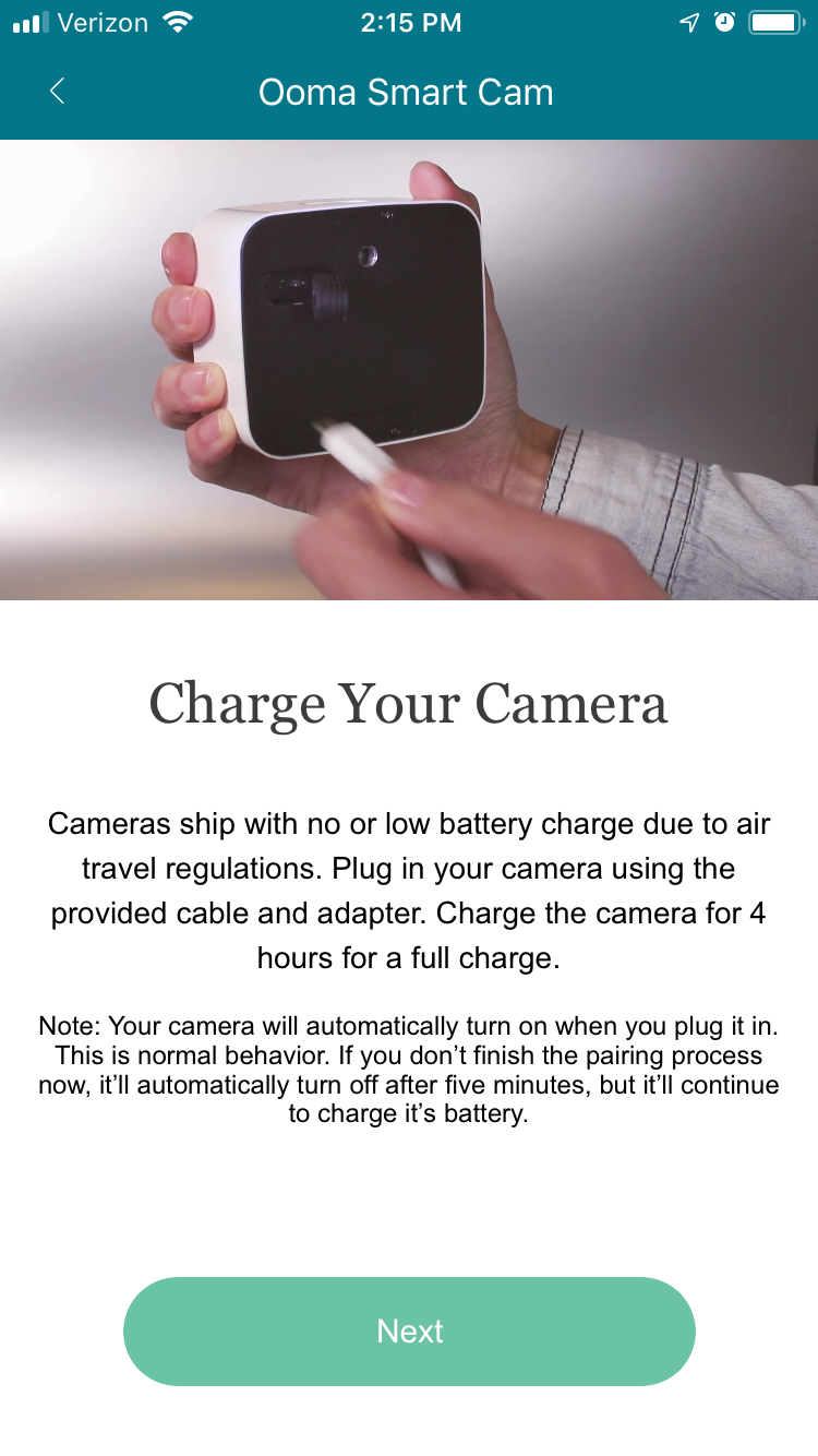
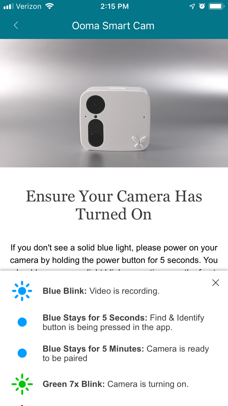
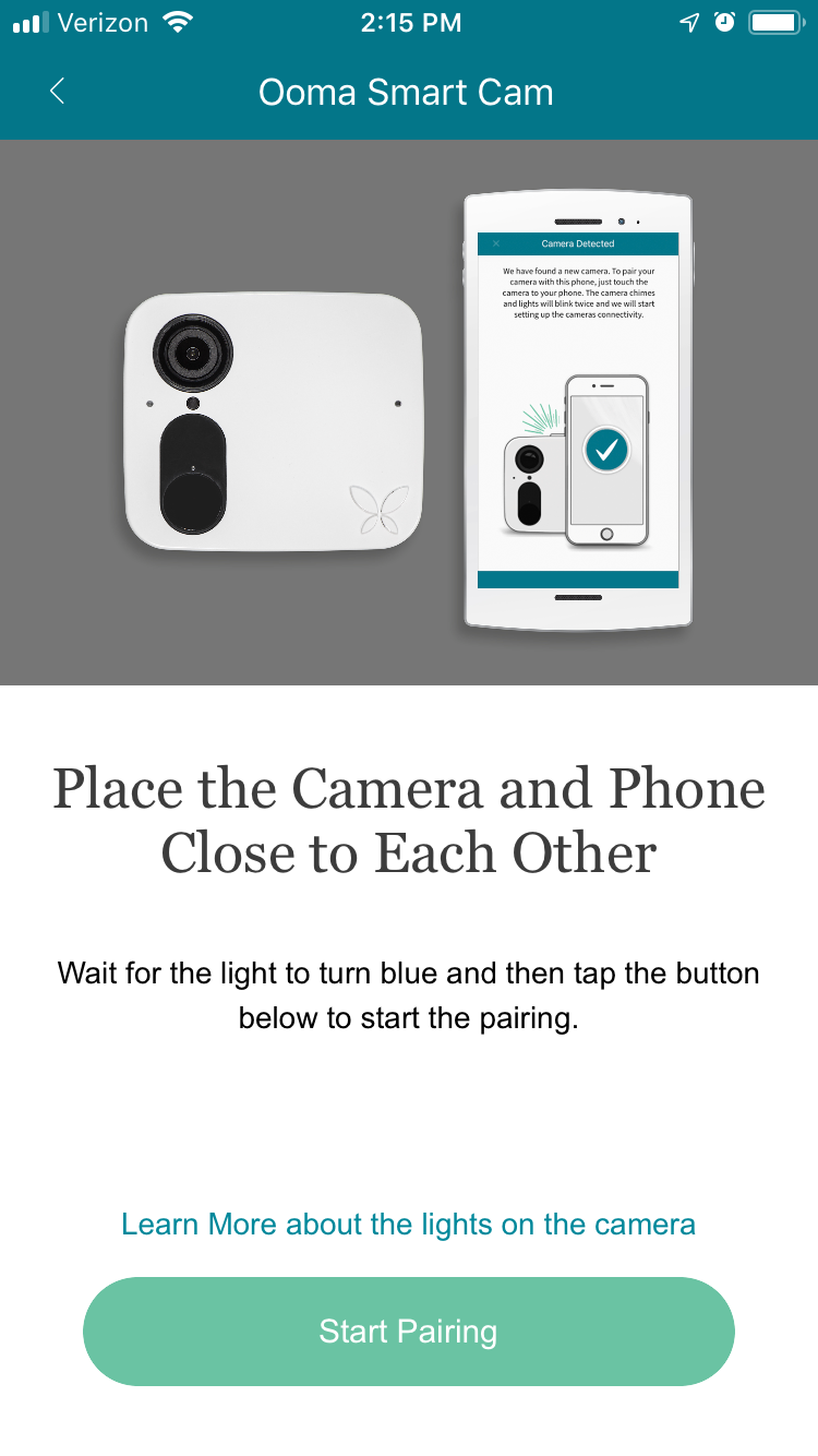
Initial Setup
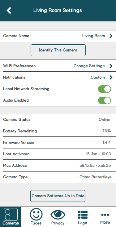
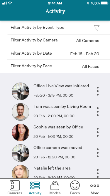
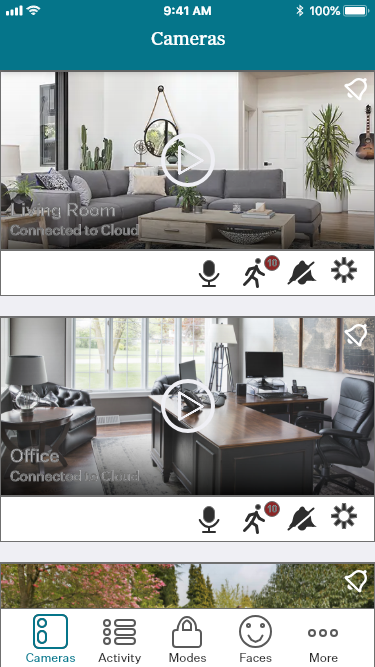
Watching live video
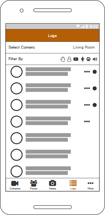
Watching past video clips
Editing Notifications
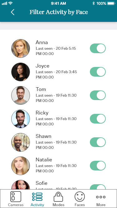
Adding faces to the Faces function
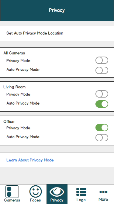
Configuring Privacy Mode
During each of these areas of testing, we paid attention to our users’ complete actions (including their actions, their expressions, and what they said) to understand their experience with each step of the study. At the end of each task, we noted if they had completed it without assistance, and asked them to rate the task experience from one to five, with five being the easiest.
Eight internal Ooma employees participated in total, five were male and three were female. Ages ranged from late 20s to early 40s, with a wide range of tech-savviness.
Initial Results:
Exact statistical results cannot be shared due to confidentiality. Roughly half our our tasks were able to be completed by each our of users and were given a satisfactory rating. The other half proved to be problematic in terms of both completion ratio and user ratings.
How did we fix it?
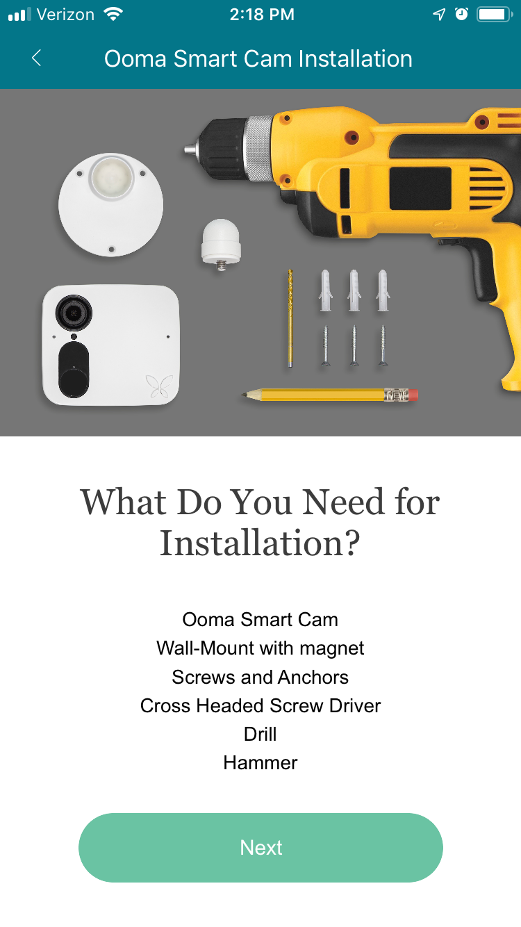
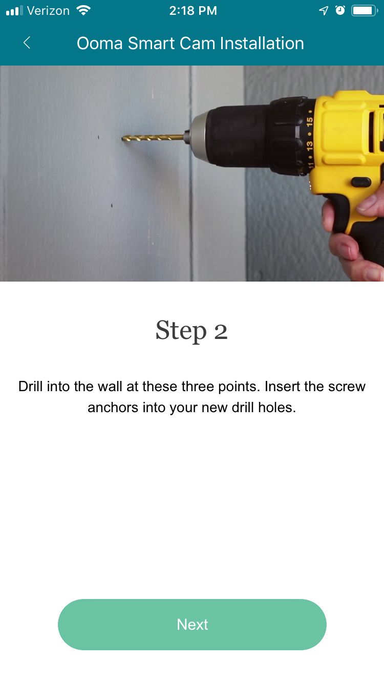
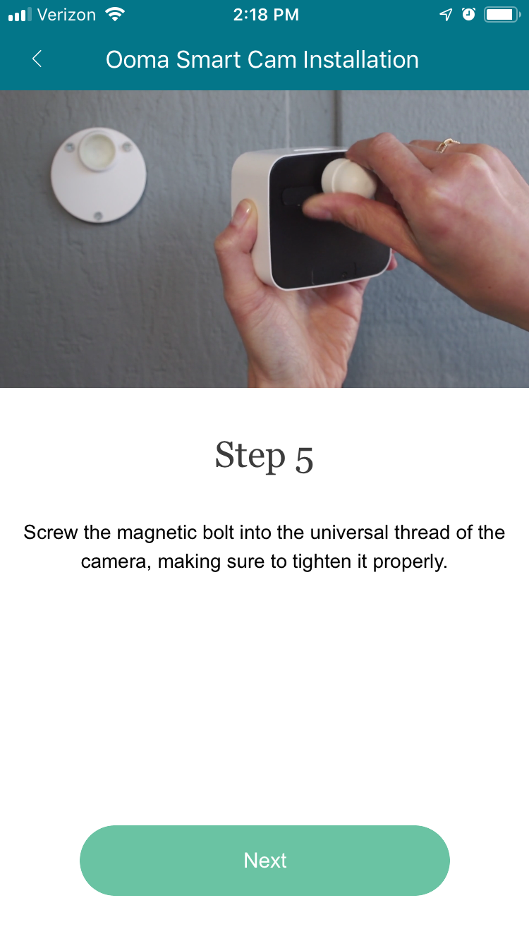
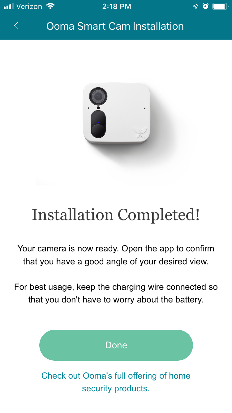
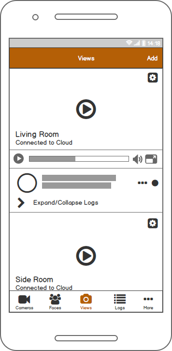
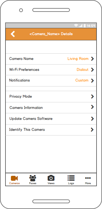
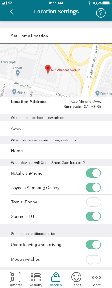
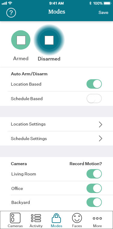
The instructions contained in the Quick Start Guide (QSG) conflicted with the instructions found in the companion app. We laid out how the QSG and the app differed, and then decided to direct the user to the app with an all new sequence of screens designed to make the setup sequence both clear and requiring the user to reference only one source of information: the app. These screens were designed by Senior Product Manager Mandar Bandekar and validated through usability testing led by me. A selection is displayed below.
During testing, users also expressed confusion over subscription types and what features were available on which subscription tier. Originally, tapping on a button to access a subscription-only feature would return a native pop-up telling the user of a subscription requirement. We rectified this problem by designing two promotional screens that also served to increase customer conversions. The first was a walk-through of the Ooma Smart Cam’s highly-promoted facial recognition features, and the second was a generalized promotional screen covering the rest of the subscription based features.
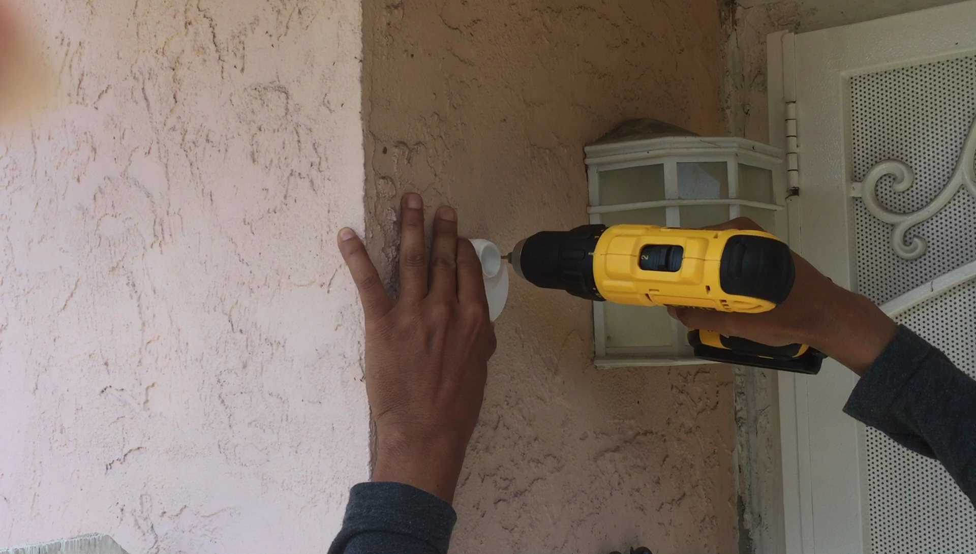
We performed a second round of usability testing with a new generation of camera once it was available, this time at people’s homes. Not only did we observe and record them creating their accounts and activating their cameras, we also observed them physically mount their cameras in an outdoor location of their choice. Still images from two of the usability tests are below. Faces are blurred for privacy.
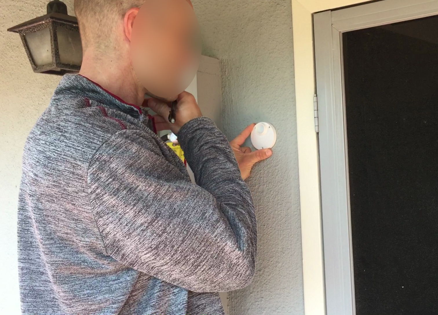
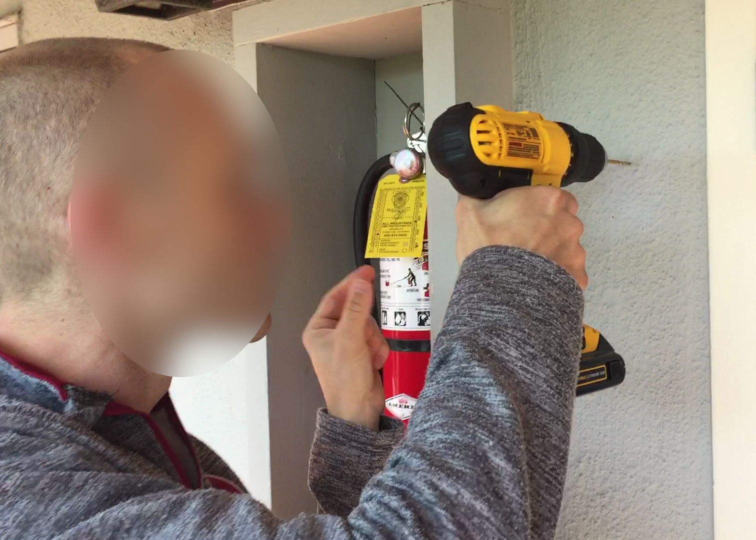
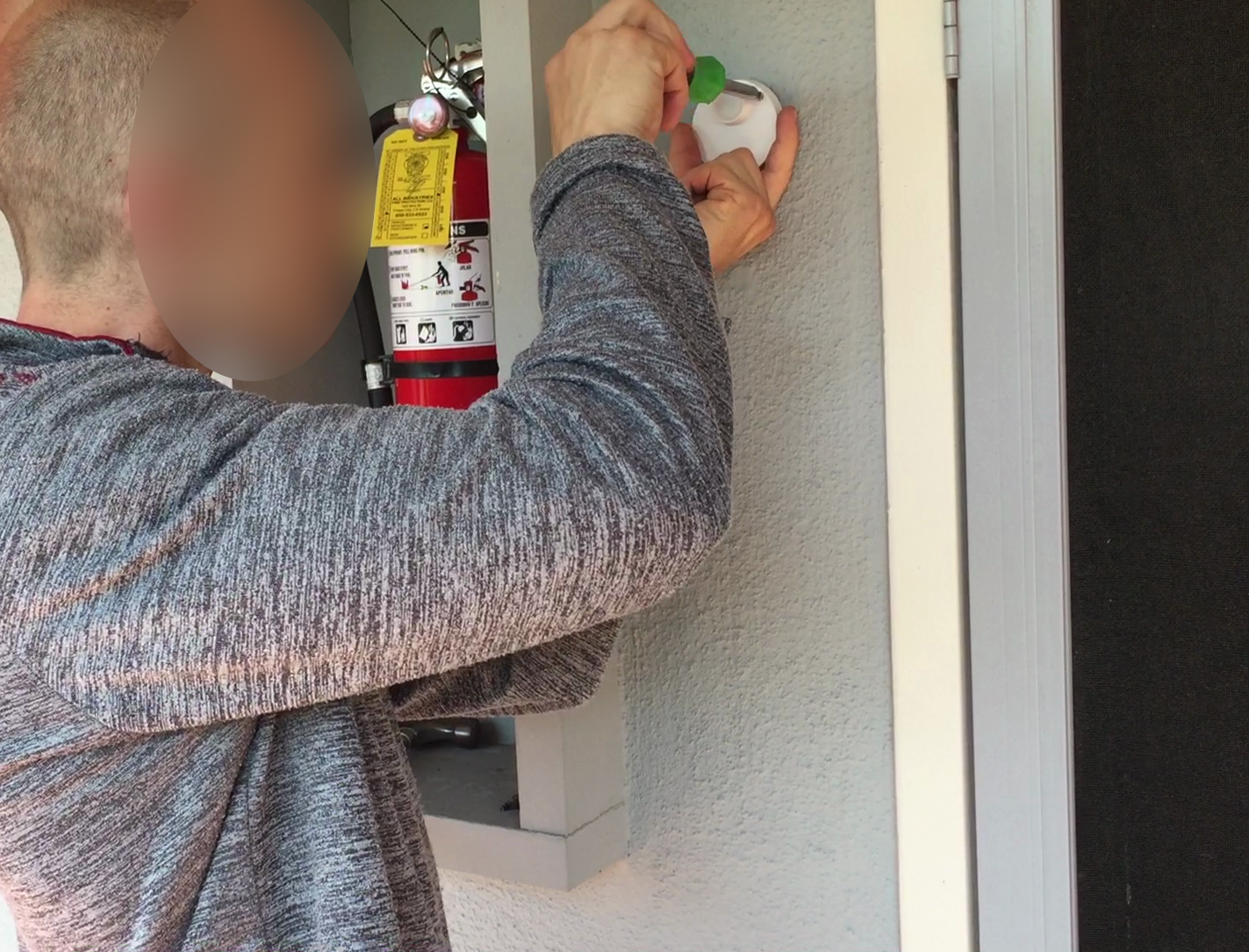
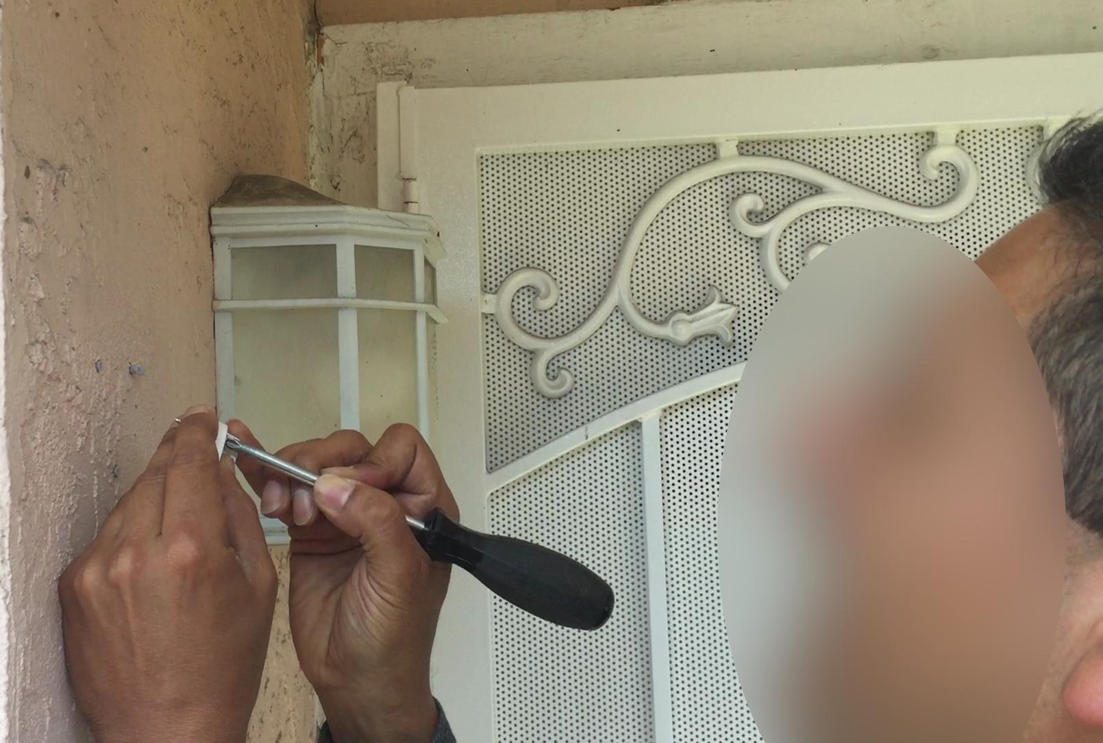
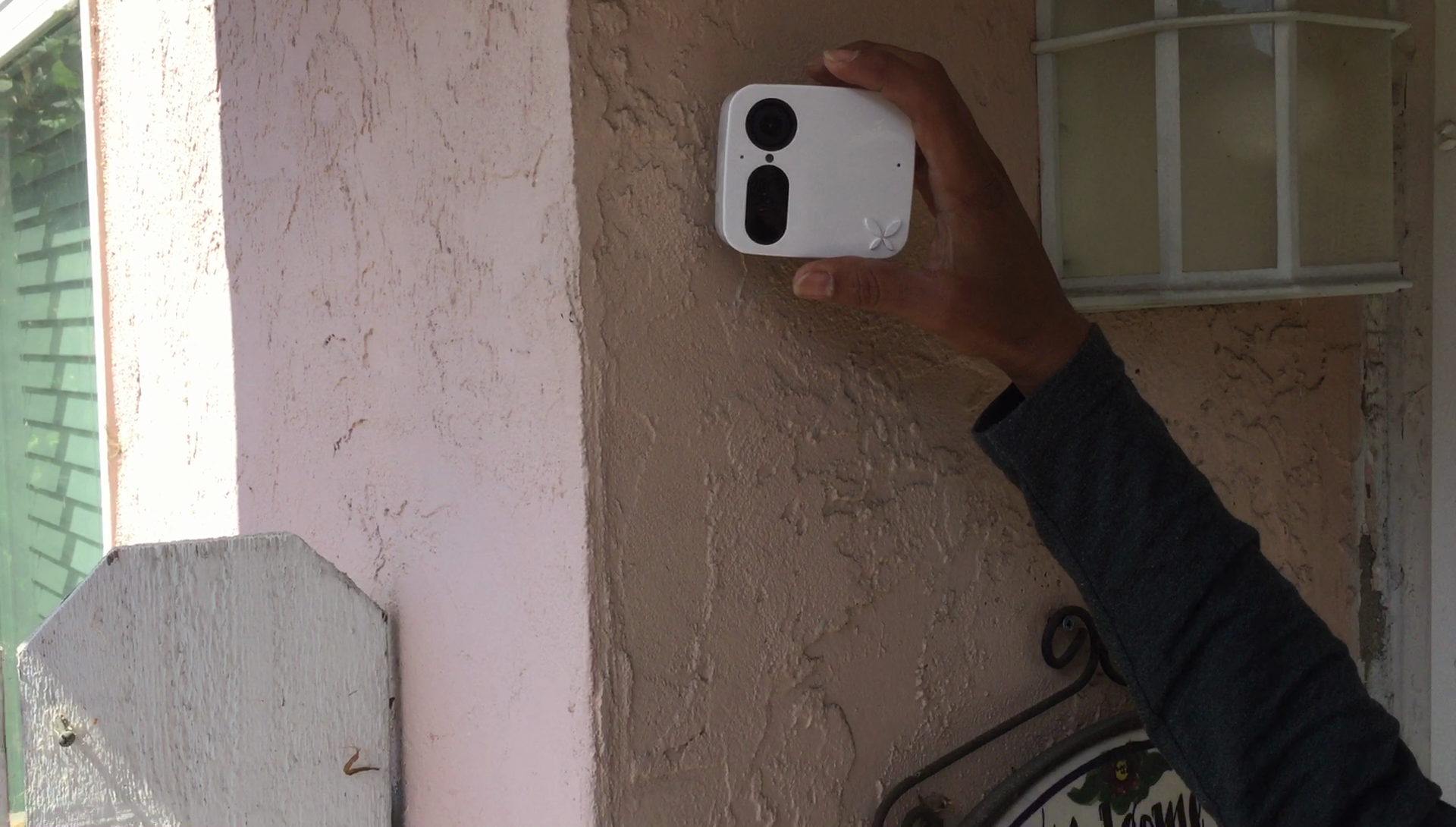
This second round of testing demonstrated that the onboarding screens allowed users to progress through the account creation and camera activation processes much faster, as well as to mount their cameras without much difficulty.
The largest change we made to the app was to propose a complete overhaul of the user interface. The overhaul had two parts:
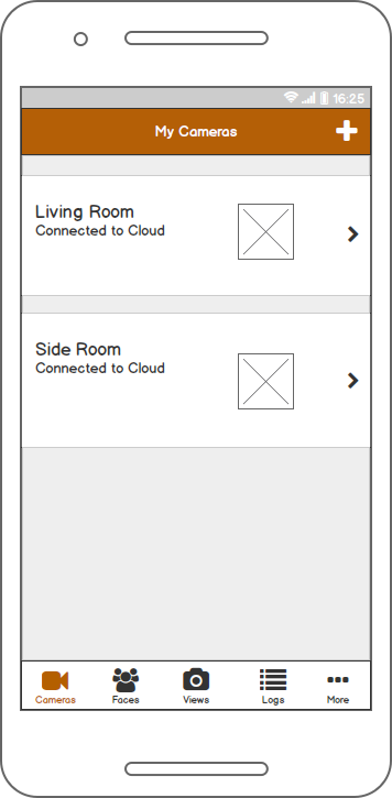
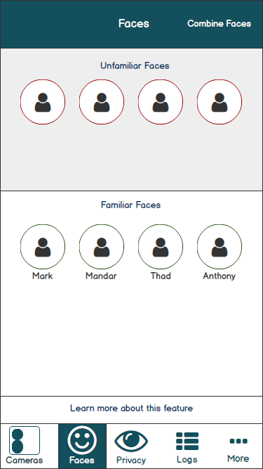
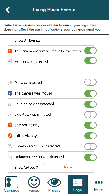
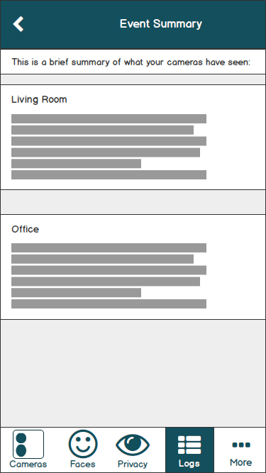
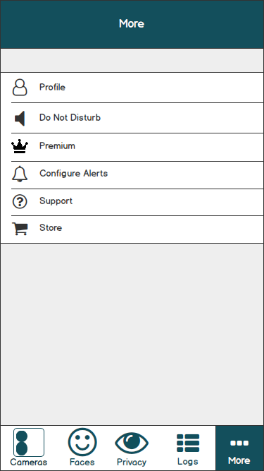
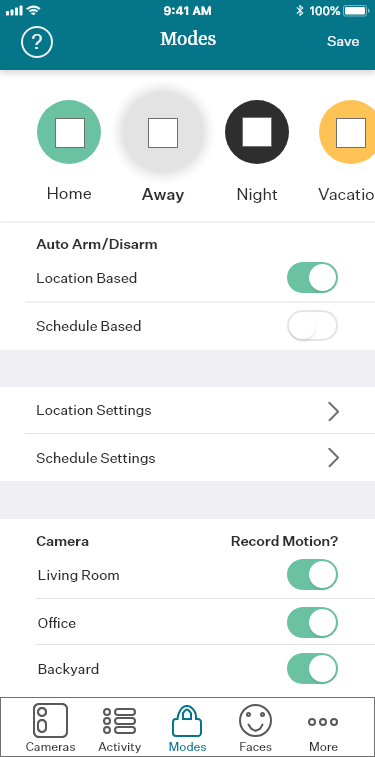
Changing the style of menu from a hamburger menu to a conventional tab bar
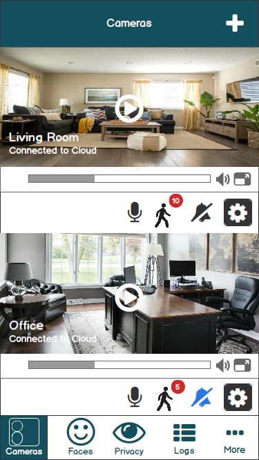
Changing the way camera views were laid out from a horizontal “carousel” to a stacked vertical view.
During the usability testing, users struggled to find menus and features that were located in the hamburger menu, which itself had problems with placement and coloration. Other features were hidden in a cog icon on the upper right, which also had color problems. Several users explicitly mentioned competing apps that did not have hamburger menus.
The solution was to switch to a conventional tab bar, a style of menu that allows frequently used features to be kept prominent. For Ooma Smart Cam, keeping frequently used features prominent and discoverable would be crucial at rectifying issues the usability testing uncovered.
To determine how the tab bar would be laid out, I performed an open card sort with 11 random participants, asking them to group features found within the app in a way that made sense to them, and then label the groups. See an example result below.

We changed the way users would browse cameras. The app had used a horizontal arrangement of cameras, commonly called a “carousel”. Usability testing revealed that the design was not obvious to users and the UI had poor cues that such an option existed. After doing competitive analysis, I convinced the team to switch to a vertical navigation, with camera views stacked on top of each other, with event logs and feeds placed in another menu on the tab bar. The first draft of these ideas was created in Balsamiq.
These were iterated on with the product team and the second draft looked like this.

If I could do this over again, I would have done some guerrilla testing with employees around the office, gathering their thoughts and feedback.
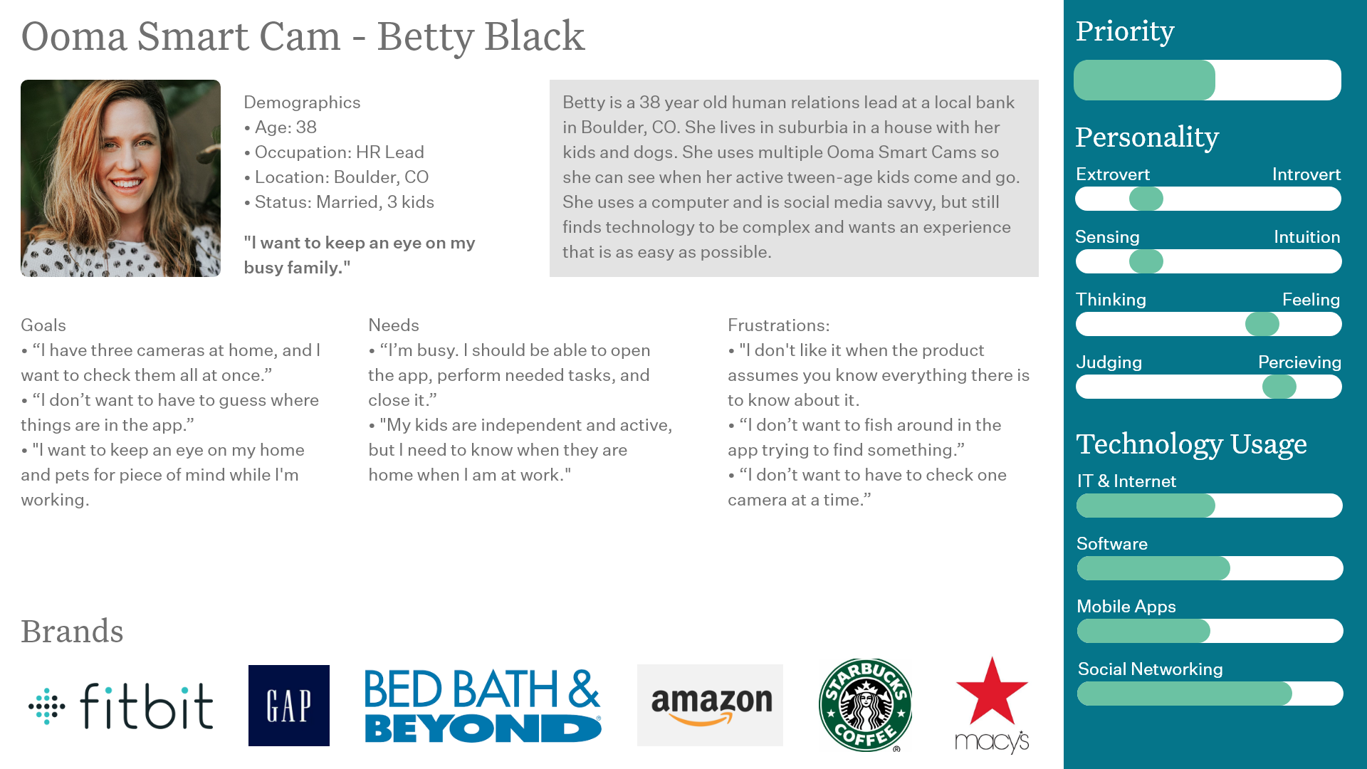
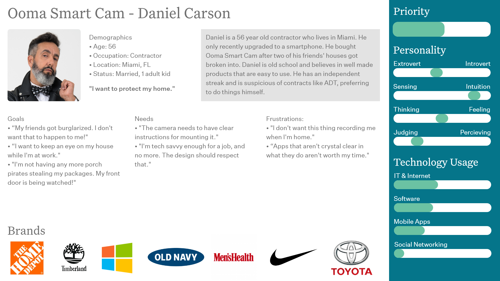
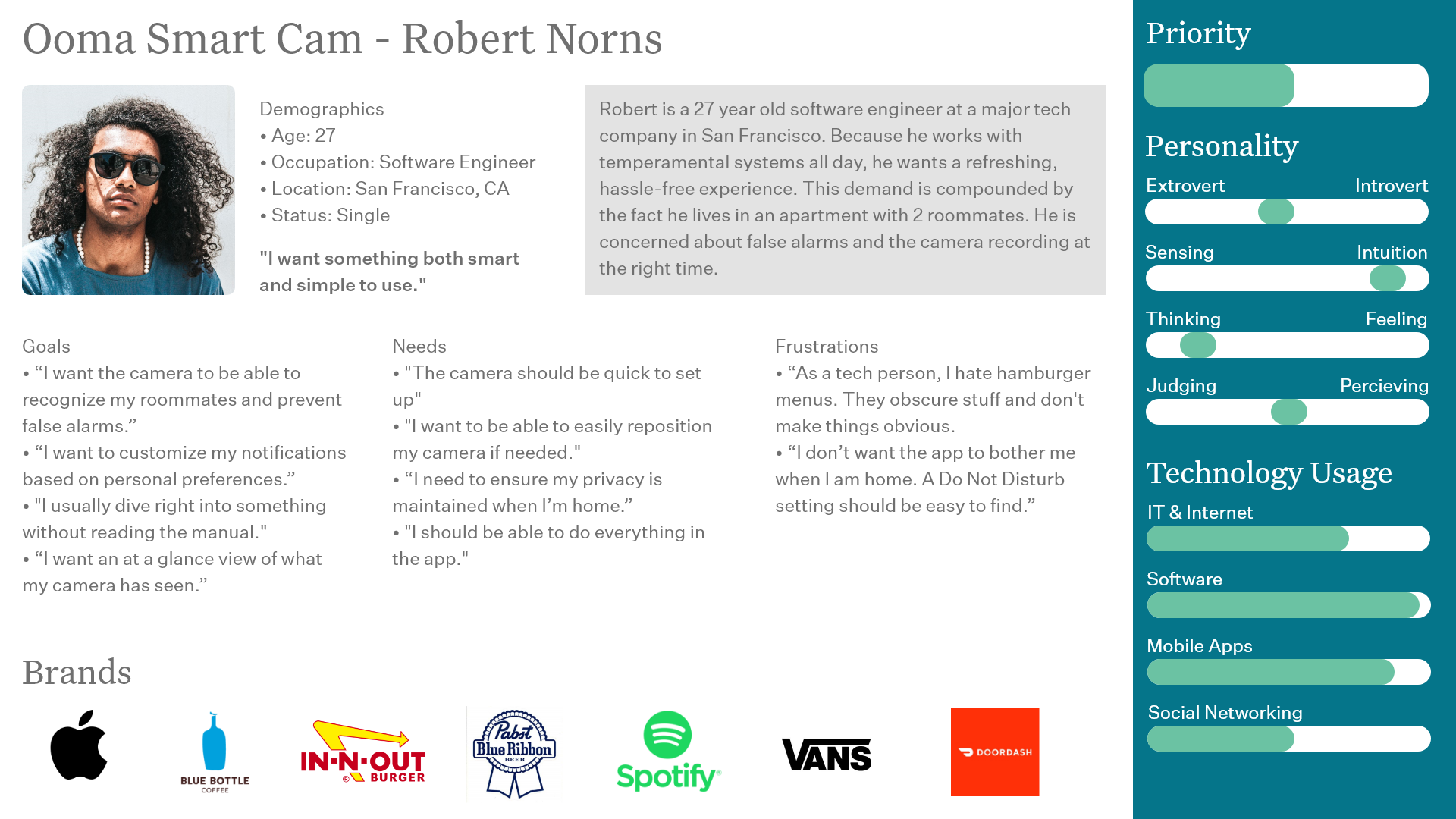
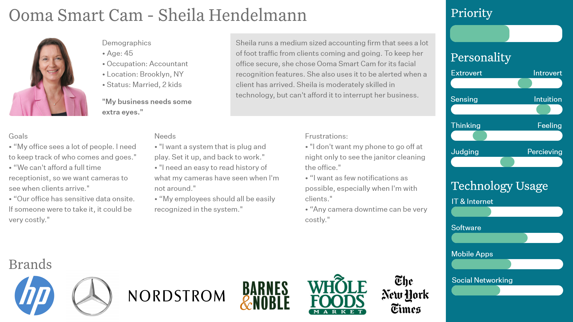
During this time, I also generated four personas for the product team based on usability testing and common market segments that purchase DIY home security products.
We continued to iterate the design, this time in Adobe XD with the proper fonts and coloration as part of Ooma’s brand refresh in 2019.
Although I left Ooma before this new UI could be built and implemented, the concept was well received by key product stakeholders, and I look forward to seeing the future of the app.
Special thanks to Mandar Bandekar for all of his help and passion for making the best product possible, and for Thad White for his mentorship and guidance.